women & the american experience | nyhs
Overview
The New-York Historical Society (N-YHS) is New York’s oldest museum, a world-renowned research library, and a leading provider of American history education. Women and the American Story (WAMS) addresses the underrepresentation of women’s roles in the American historical narrative. Through programming and a comprehensive digital curriculum resource for 6-12 teachers, it aims to improve the teaching and learning of U.S. women’s history and promote female empowerment, particularly in STEAM-related fields.
IBM iX designed an intuitive, modern, responsive website and design system, that can easily be used by educators on-the-go. With curriculum content scheduled to be delivered over a period of four years, the website offers two complete units and a rewarding experience right from launch, and is designed to accommodate a multi-year build out and be maintained by N-YHS.
WAMS is fulfilling a mission of national importance in making the stories of women in American history available to educators in a structured, thematic, pedagogical way. WAMS enables NYHS to deliver a world-class, first-in-kind teaching resource that fills a large gap in American education today.
UX
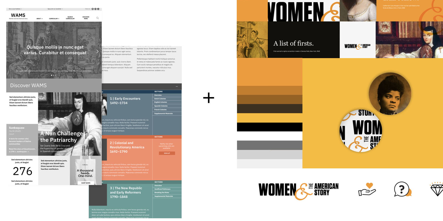
The structure and entire scope of the curriculum is visible from the navigation. It is clear what units are available and when. Units are color coded for ease of navigation. The framework allows NYHS to seamlessly integrate remaining content over 3 years.
Intelligent keyword search and filtering functionality is extensive yet logical, easy to use. Users can navigate content through passive guidance.
Complex content is organized and presented in a visually clear and distinct manner, cross-referenced and hyperlinked.
Provide extensive printing options for teachers to customize and integrate resources easily into their lessons.
VISUAL DESIGN + UI
The logo is strong and bold yet preserves the N-YHS existing ampersand and brand color so there is consistency.
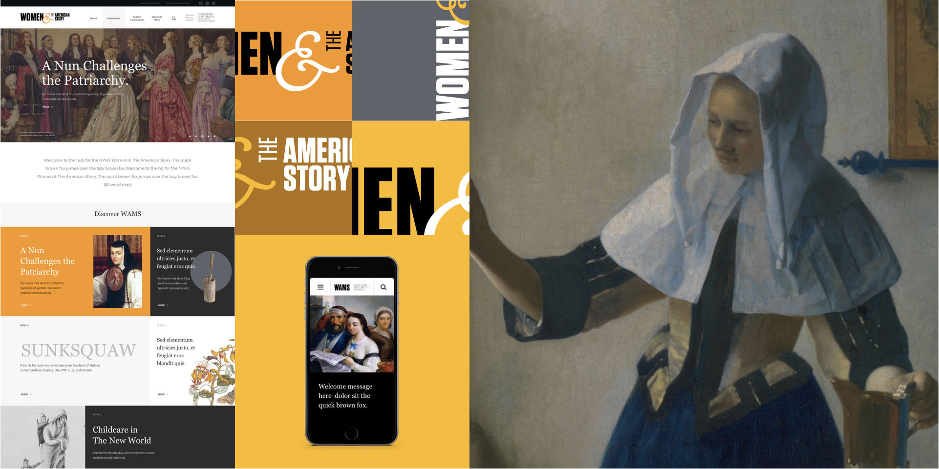
Because all of the content is historical in nature and also spans hundreds of years with many different styles, it was important to balance that out and unify it with a rigorous, modern sensibility. The color palette for the units— saturated, bright colors — became the palette for the site. Because the logotype was all-caps, san serif and bold, a lighter, slab serif was selected for the headlines and body copy.
4. 5. Silhouetted images, solid backgrounds subtle, abstract patterns and simple, outline icons complete the look. Light-hearted copy juxtaposed with historical imagery, gives a fresh, modern spin.
development
Pages were indexed with the appropriate years and tagged with categories and filters in the back-end. They can be called when specific filters such as Date Range and /or Region are activated in search.
The Avada Theme applied to the CMS allowed for the creation of template pages and several plug-ins responsible for search functionality, tagging, SEO, print, and custom menus. Within the CMS, content boxes were designed to scale on either a desktop or mobile device. The simplicity of the editing procedure allows NYHS to make any desired changes to their site after hand-off.
Curriculum dedicated pages were converted into printable resources for teachers and students. Images print full-size and content is styled.
design team
IBM iX | Pei Hsieh (UX), Greg Gennaro (UI / Visual Design), Sean Loyless (Development Consulting)


